
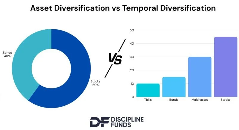
The power of asset-liability matching in one image.
The chart on the left is a traditional presentation of asset diversification. The chart on the right is an ALM based presentation of temporal diversification. The chart on the right could be roughly 60/40, but unlike a simple 60/40 index its disaggregated components tell a very different story.
Not only does the chart on the right have a lower sequence of returns risk, but it communicates a totally different story to the investor because it shows you more clearly, how certain assets align with your life’s corresponding financial needs.
Good asset allocation can’t only be a process in asset diversification. For good financial planning it needs to also be a process in quantifying and communicating time horizons as well.